News & Blog

Smithsonian features MADS Film Essay “INHUMAN FIGURES”

By CA Davis

“The human can be redefined, and the future can be remade too. The question remains: in whose image?”

Michelle N. Huang

Over the past two years, the Media and Design Studio’s digital storyteller, CA Davis, has been working with English and Asian American Studies assistant professor Michelle N. Huang on the Studio’s latest film essay — INHUMAN FIGURES: Robots, Clones, and Aliens. Based on Huang’s research on Techno-Orientalism and the ways in which racial stereotypes pervade popular American films and television, INHUMAN FIGURES is now streaming as part of the Smithsonian Asian Pacific American Center’s online exhibits. You can watch it at https://smithsonianapa.org/inhuman-figures/.

INHUMAN FIGURES examines three popular science fictional archetypes—the robot, clone, and alien—and illuminates the racial logics and histories that underpin them—namely, the tireless worker, the indistinguishable copy, and the forever foreigner. By bringing to light lesser-known and forgotten histories, Huang shows how sci-fi futures are built on the backs of “humans that have [always] been less than human.”

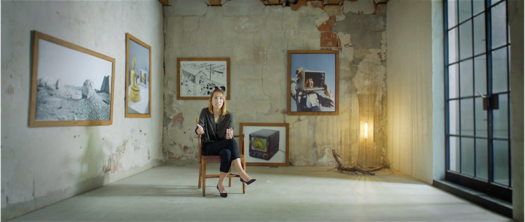
Assistant Professor of English and Asian American Studies, Michelle N. Huang

Breaking down examples of popular films such as Ex MachinaCloud Atlas, and Arrival, the film essay makes visible how these racialized tropes are utilized in the process of U.S. nation-building and future-making. And while popular film and television provides plenty of material to critique, few offer an alternative vision. “There is a limit to how many times you can see naked Asian American clones be thrown in an incinerator without feeling dehumanized yourself,” comments Huang.

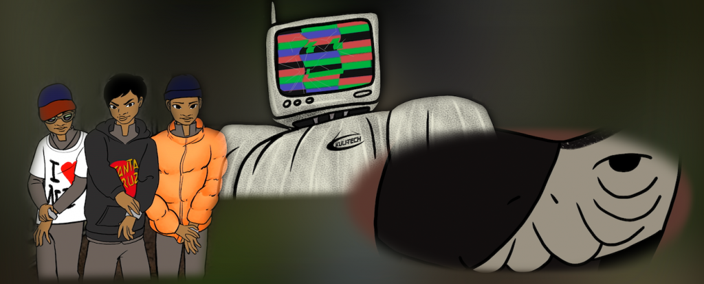
the film’s titular characters — top, robot; left, clones; right, alien

In order to fill the visual gap between the overused stereotypes in dystopian films and the possibilities of reparative speculative futures, the production evolved to incorporate the animation of three independent artists: Chicago local Keith Couture, and Evanston sisters Brittney and Crystal Galloway of the indie animation house, Sleepy Gallows Studio. Much of the production was spent conceptualizing, planning, and iterating the eight minutes of original animations based on a story arc that peels away the facades of these future beings in order to reveal the people living under their masks—no small task for a three-person art team.

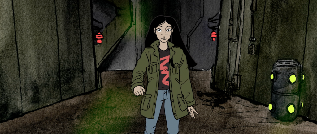
our Asian American everywoman, Emi, discovers the people beneath their scifi facades

And while the film dissected such racial stereotypes about Asian Americans head-on, it is notable that the production team of INHUMAN FIGURES itself reflected the multiracial coalition building that coalesced throughout 2020 amidst a surge in the Movement for Black Lives against police brutality and racial violence. The team’s animators, Brittney and Crystal Galloway, are themselves representative of a burgeoning wave of Afro-Anime enthusiasts whose work is directly inspired by the decades of rich, hand hewn Japanese animation.

“Working on this project has reminded me that there are other ways to animate,” Brittney Galloway reflected. “I was trained in the traditional American way and many of the teachers looked down on anime. The mixing of frame rates is much more common in Japanese animation as they are still experimenting as opposed to the West where it’s ‘perfected.’ While there are shots I wish I had more time on, overall, I don’t think the production suffered. In my future endeavors, this project will be a reminder that there’s always a way to make things more practical without sacrificing too much quality.”

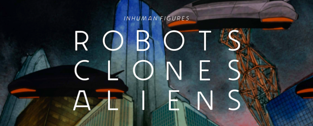
banner image from Smithsonianapa.org

INHUMAN FIGURES is a 24-minute film accessible free of charge via the Smithsonian’s Asian Pacific American Center online exhibit. Visit the exhibit here:https://smithsonianapa.org/inhuman-figures/

Reading the City and Telling its Story in Alternative Forms

By CA Davis

For several years, Classics professor Francesca Tataranni has guided students in developing their own video-driven essays and map-based walking tours in her acclaimed ‘Ancient Rome in Chicago’ course.

Now, the Media and Design Studio is honored to unveil her latest work in conjunction with the studio, an exploration of her own, titled “One Dark Wall”

Since 2015,  Francesca Tataranni (Charles Deering McCormick University Distinguished Professor of Instruction of Classics and Director of the Latin Program) teaches her course, Ancient Rome in Chicago, a seminar that asks students to use Chicago—it’s buildings, it’s concrete, it’s public art—as a resource for the film essays they make throughout the quarter. For the past five years, Francesca’s students have helped create a virtual walking tour of Chicago’s buildings that utilize classical, Roman architecture. Francesca often called on the expertise of the Media and Design Studio to help teach best practices and styles when creating these film essays. But, in the winter and spring of 2020, Francesca collaborated with the Media and Design Studio’s digital storyteller, CA Davis, to create her own film essay on a controversial mural in Lincoln Square’s Sulzer Library.

Several years prior, Francesca found herself surrounded by four walls covered with raw paintings of a visual interpretation of Virgil’s Aeneid. What struck her wasn’t the sheer amount of work that Irene Siegel put into the murals in 1985 but the dark, gastly depiction of the underworld on the entrance wall that stands in opposite to a fire and brimstone depiction of the Trojan War.

“Seeing the Dark Wall for the first time was truly overwhelming,” Francesca recalls. “I remember surveying the wall over and over again from all directions in an attempt to make sense of the shattered quotes and anguished images that cover its entire surface. The more I looked, the more frustrated I grew.”

And it turned out she wasn’t the only one who was taken aback by the mural’s visceral imagery.

Irene Siegel painted her interpretation of the Aeneid in 1985, right in the middle of the Reagan administration—a time which, Francesca discovered, influenced the painting as much as the public’s reception of the work itself. Over the following months, Francesca unraveled the painful story of Irene’s months-long battle just to finish the mural amidst severe outcry against her visual style and personal attacks as an artist. When thinking about how to relay this story, Francesa first wrote the story into a research paper which compared the mural’s visuals with the original text. What she revealed was how Irene Siegel’s feminist reading of the Aeneid is portrayed in the figure of Dido, who Francesca calls, “the true hero of the Aeneid.”

When Francesca approached the Media and Design Studio, she did so with two intentions. The first was to create a visual essay based on her written work surrounding the mural in order to accurately portray the painting in the context of her feminist, political reading of Irene’s art. The second was to learn what it takes to professionally develop such a film essay so that she could use her film while teaching her students how to create their own. What followed was a months-long process of rewriting her essay into a scripted voice over narration, and multiple days of filming on location to re-enact her discovery and research of the mural itself.

“Working with John (Bresland) and CA (Davis) on the video script was an incredibly enriching and liberating experience. They showed me how to let go of some concerns and constraints that usually drive my writing of words on a page and allow visual and sonic elements to dance with the pen.”

The Media and Design Studio’s digital storyteller, CA Davis, was tasked with combining all these elements into a coherent, flowing story that accurately depicts the history, politics, and re-reading of Virgil’s original text in the light that Francesca shone. The result is the film essay entitled, One Dark Wall, which can now be watched via the link below.

In March of 2021, Francesca plans to use this film as part of the Department of Classics’ end-of-quarter event on the reception of classical works such as the Aeneid. You can sign up to watch that event via the link below.

https://planitpurple.northwestern.edu/event/572094

MADS Fall 2020 Operations

By Matthew Taylor

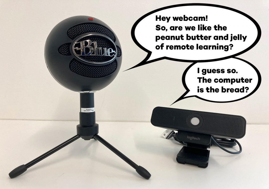
A comic photo where a round microphone says to a webcam "Hey webcam! So, are we like the peanut butter and jelly of remote learning?" The webcam replies, "I guess so. The computer is the bread?"

MADS new equipment decides to get a little chummy.

We are open for fall!
Well, as much as we can be!

As various campus units work to plan for a mix of remote instruction and a very sporadic few on-campus classes and activities, so also is the MAD Studio making plans for modified Fall operations. In addition to our traditional equipment pool, we have added a few new resources to support acute remote instruction and video conferencing needs. There will be a revised circulation process to reduce contact and allow greater time to more thoroughly clean equipment and facilities between uses.

Of particular note is that, with very few exceptions, all of our facilities and resources will be available only by reservation and transactions made only by appointment, even when our doors are open.

Activity Space and Equipment Circulation

Immediately following the Wildcat Wellness quarantine period, the Media and Design Studio will open its doors to receive staff, faculty, and students with resource reservations and/or who have made equipment check-in or check-out appointments. Contactless equipment transfers may also be arranged during Wildcat Wellness.

Fall Quarter Hours

September 21 through November 25
Monday – Friday  10:30 a.m. – 2 p.m.

Please note the following changes to our procedures:

  • Equipment circulation is by reservation only (24+ hours in advance) with all pick-ups and returns scheduled during our open hours (weekdays 10:30am – 2pm)
  • Patrons should use the WebCheckout patron portal to reserve equipment. Beginning Tuesday September 8, our new items and new lending policies will be reflected on WebCheckout.
  • Email requests are discouraged, and telephone requests are strongly discouraged due to reduced staffing.
  • While our lab will be officially closed at this time in observance of the Wildcat Wellness quarantine period, equipment will be available via contactless “front-steps-pick up” on weekdays Thursday September 10 through Friday September 18.

Available Equipment

We have a variety of equipment available for specific remote instruction needs:

  • Second generation iPads (note, these are compatible with Zoom screen sharing but do not run the latest iOS nor support Apple Pencil — if you require this feature, contact us for alternate recommendations)
  • Logitech BCC950 Conference Cameras (with integrated speaker and microphone and remote control zoom, pan tilt)
  • Zoom/Panopto Portable Studio kits (includes Logitech webcam, ring light, camera tripod, headset, studio microphone)
  • USB Studio Microphones (podcast-quality tabletop microphone)
  • Headsets (integrated microphone and over-the-ear headphones)
Loan Terms
  • Unless otherwise specified, equipment loans will be for a period of up to two (2) weeks. Equipment loaned will have a specified return date which must be honored.
  • As always, a renewal may be requested but they must happen prior to the item(s) becoming overdue.
  • Depending upon observed demand, equipment loans may be renewed or potentially extended to the full academic term. Term loan equipment will be due back before or during finals week.

Cleaning protocol

After items are returned to the Media and Design Studio, they will be both briefly quarantined and thoroughly cleaned by electrostatic misting and/or ultraviolet light. Once this process is complete, items will be reassessed and discharged. The items will not be released from your responsibility until after they are cleaned so you will receive two notifications upon return of borrowed items: (1) The item has been received and (2) The item has been discharged.

Space Reservations

The Media and Design Studio offers spaces which may be useful to students, faculty, and staff during this period of remote instruction. Reservations can be made via Bookings beginning Monday September 14.

Computer Workstations

Six (6) computer workstations in the main Activity Space of the MAD Studio are reservable for all patron classes during our open hours (M-F 10:30 a.m. to 2:00 p.m.). These workstations offer access to Adobe Creative Cloud applications and a host of other useful programs. Select workstations also offer additional capacities such as document and/or photo scanning.

These workstations are reservable for periods of up to 2 hours, with a required spacing of 1 hour between users.

To reserve, visit this Bookings page: https://outlook.office365.com/owa/calendar/MediaandDesignStudioWorkstations@nuwildcat.onmicrosoft.com/bookings/

Lecture Recording Classrooms

The two MAD Studio computer classrooms (K2524 and K2530) are equipped with whiteboards, resident computers, and remote controlled lecture recording cameras which can be used to pre-record or broadcast a (synchronous) class lecture.

Classrooms are reservable according to the following scheduling policy:

  • Reservations for Faculty only
  • Operating Hours: Monday through Friday 9am-5pm
  • Maximum 3-hour reservation
  • Minimum 1-hour gap time required between users

Lecture/Audio Recording Suites

Additionally, MAD Studio offers two recording suites that are available for seated lecture preparation, capture, or live presentation. Each of these is equipped with a resident computer, studio microphone, and optional drawing tablet.

  • Studio 2531
  • Studio 2533

Suites are reservable according to the following scheduling policy:

  • Reservations open for all class of patrons
  • Operating Hours: Monday through Friday 9am-5pm
  • Maximum 3-hour reservation
  • Minimum 1-hour gap time required between users

Here for You

These are unprecedented times for our University and our world. We know that there are many challenges associated with remote instruction and are here to assist in any way that we can, through our facilities, with our resources, or by sharing advice and expertise related to teaching and/or scholarly technology.

Together we’ll make it through this!

MAD Studio to Join Weinberg College IT Solutions

By Matthew Taylor

There are some some exciting behind-the-scenes organizational changes taking place at the start of the 2019-2020 academic year for the Media and Design Studio. We hope that these changes will enable new opportunities for growth and enhancement of our services, all while keeping the same commitment to our faculty collaborators, their manifold instructional support needs, and the continued development of innovative pedagogical and scholarly projects.

As the main part of its organizational change, the Media and Design Studio is shedding its legacy classification as an academic program and becoming an administrative unit that is fully connected to Weinberg IT Solutions (WITS). In many ways, this new classification better reflects the technical nature of the work that we do, and follows decades of existing partnership.

Although we are changing organizationally, our mission is the same. With a nod to our 50-year history that began as the Northwestern Language Laboratories, we keep our attention to the technological and pedagogical needs of language instruction, even as we bring many of the techniques and solutions originally pioneered in this area to the benefit of scholarly activities spanning the broader humanities.

In the new organization, I will continue to oversee the unit’s development, services, and support operations as Director of the MAD Studio. In this capacity, I report to Mike Satut, Senior Director of Information Technology for Weinberg College. Together, Mike and I look forward to identifying all of the ways our technology teams can nurture a helpful cross-pollination of ideas​ and improved sharing of resources.

Working with me in MADS is the same great team that has earned accolades for their professionalism and performance:

  • ​​​Cecile-Anne Sison, a leading voice on instructional technology and the focal point of the daily operations in the “lab”
  • ​Sergei Kalugin, the Studio’s lead developer whose design and engineering are behind all of the unit’s stunning web and mobile projects; and
  • ​C.A. Davis, a resident digital storyteller who has engaged with faculty to help them communicate their research and teaching to wider audiences

We are the same team, have the same mission, and so also do our services remain the same. For example:

  • ​​We offer customized technology enhanced teaching spaces with computers equipped for individual and group audio activities, videoconferencing equipment, and ultra-high-definition presentation systems. ​
  • Faculty can request cameras, audio recorders, or iPads for a course, receive advice on sharing audio or video with students, or simply check out a missing adaptor for their computer.
  • Our web and mobile development projects remain very much in progress, as are plans for support and upkeep. And, we eagerly await many more innovative and collaborative project ideas to come.
  • ​We offer workshops on various topics of interest to faculty and students, and stand ready to provide teaching assistance for digital tools and techniques in various courses.

We will endeavor to keep our services and support responsive to what is most valued or needed. And, with the help of your input and feedback, we anticipate continuing to​ update and enhance​ our offerings in the future.

For services and support, our e-mail contact addresses are the same:

  • ​Room reservations and questions: mads-rooms@northwestern.edu
  • ​Equipment reservations and questions: mads-circ@northwestern.edu
  • ​General inquiries, feedback and project questions:  madstudio@northwestern.edu

Please feel free to share requests, ideas, suggestions, or questions through these channels or with any of us personally!

The Pulter Project

By John Bresland

On Building a 21st Century Reading Experience with a 17th Century Poet

In 1974, when The Riverside Shakespeare was published by Houghton Mifflin, the venerated two-volume collection of Shakespeare’s poems and plays was thick as a Tewkesbury mustard. The edition came loaded with extras. So many extras—in the form of notes, footnotes, critical essays, justifications for modernized language, photographic inserts and more—that Stephen Booth, reviewing the 2,057-page collection for the New York Review of Books, feared its monumental size “would cause iatrogenic malnutrition in students” and would be too heavy to carry to class.

Today, four decades and two editions later, many students of Shakespeare are still hefting that “big, ugly” Riverside like seven pounds of early modern flesh. Despite the bracing sticker price of $200, a great many professors, sold on the critical bona fides of those extras and lured by the convenience of everyone being on the same translucent page, require students to buy it.

Booth believed that Houghton Mifflin’s sales strategy—bundling critical notes pitched to faculty in order to tap the student market—positioned the student as a permanent outsider. The Riverside failed as an aesthetic experience, he wrote, because “its concerns are usually different from, inconsistent with, and invidious to the concerns of those who will read it.” It’s hard to make something good. Harder still when a crucial piece of that something is authored by someone else, for someone else.

Happily, there are technological affordances that enable us to meet literary figures on more intimate terms, free of editorial cruft. We can, for instance, build an edition around a poet whose life briefly overlapped with Shakespeare’s. And we can front that edition with contributions by critics and scholars—as did the Riverside. Crucially, though, we can make those notes and essays disappear with a tap, leaving nothing visible to the reader but the original ink-smudged manuscript. And we can make it free.

With The Pulter Project: Poet in the Making, edited by Wendy Wall and Leah Knight, developed by Northwestern’s Media and Design Studio, that’s what we did.

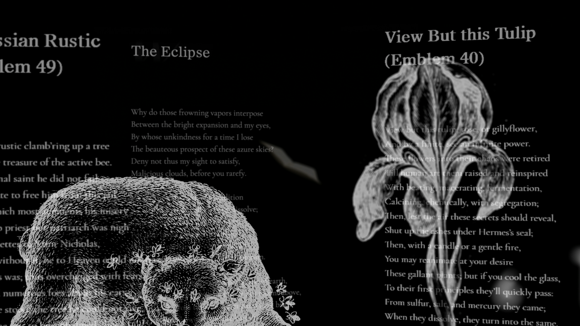
The Pulter Project is a digital collection of Hester Pulter’s poetry, engineered to adapt to the concerns of all who will read it. Readers seeking minimal interruption and basic editorial notes can activate a pared-down elemental edition, while those seeking additional context and commentary can enable the site’s editorially beefed-up amplified edition. The cumulative effect might be compared to visiting a museum that not only displays works on the wall, but gives us a chance to enter into that work, the making of it, the reception of it. The Pulter Project is also outfitted with a tool that compares editions side-by-side for a granular study in how poems evolve as they’re touched by different editors—as well as numerous other means of accessing the verse of this 17th century artist whose work was nearly lost to history.

Nobody seems to know a whole lot about the route taken by Pulter’s calfskin-bound manuscript before it was found by Mark Robson, a graduate student with a keen eye for verse, in a Leeds University archive in 1996. Prior to Robson’s recovery, the manuscript was owned by Gilbert Ingefield, a former architect and book collector who also happened to be the mayor of London. Ingefield auctioned off the book at Christie’s in 1975, when it was acquired by Leeds.

The Pulter Project interface was designed by Sergei Kalugin, a Russia-born developer who maintains exacting diets and competes in triathlons. “The initial design,” he says, “was based on the fact that the only real thing that we have here is Pulter’s manuscript. It’s the pillar. I was convinced from the very beginning that the reading itself should be the sole focus of the interface.” He notes that even printouts of the poems, the overlooked stepchild of screen-centric digital publishing, are intended to please the eye.

“Early on,” says Kalugin, “as we researched other digital editions, one thing struck me: the default mode for pretty much all of them was severe overload. I didn’t like that. I tried to avoid that overwhelming quality. With the Pulter Project, we wanted the user to feel comfortable doing one thing. Reading.”

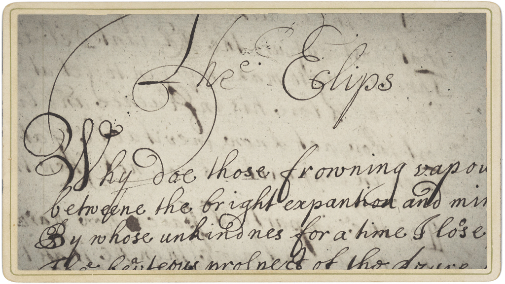
Among the site’s more poignant features is access to scans of Pulter’s manuscript. There’s an inescapable intimacy to these hand-lettered pages. That this should be meaningful probably says more about our touchscreen era than anything else, when the mortal sweat of a made thing is routinely concealed from us. It seems not to matter that most of these poems were copied from earlier drafts by a scribe rather than Pulter herself (though corrections believed to be in Pulter’s hand are laced throughout the manuscript).

What does matter is that a reader today can glimpse how literature was made in the 17th century, before print culture dominated. Hint: it’s maybe not that different than the 21st century, when nearly all writers continue to rely on coteries of trusted readers, friends, and frenemies. This is one of many ways The Pulter Project argues, through its breadth of features—the ability to compare editions, the ability to offer multiple edits of Pulter’s poems in a way that’s transparent to the reader—that literature is rarely, if ever, the work of one.

Partial scan of The Eclipse

Detail of “The Eclipse,” from Pulter’s manuscript, circa 1660.

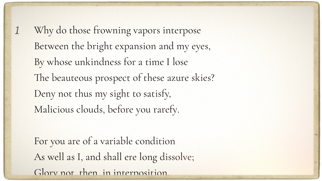
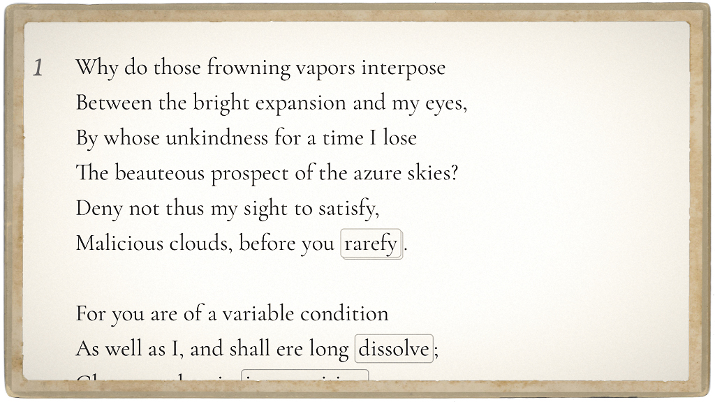
Elemental edition of The Eclipse, by Hester Pulter

Readers can view the elemental edition of “The Eclipse” for a minimalist rendering of the poem without visible editorial intervention.

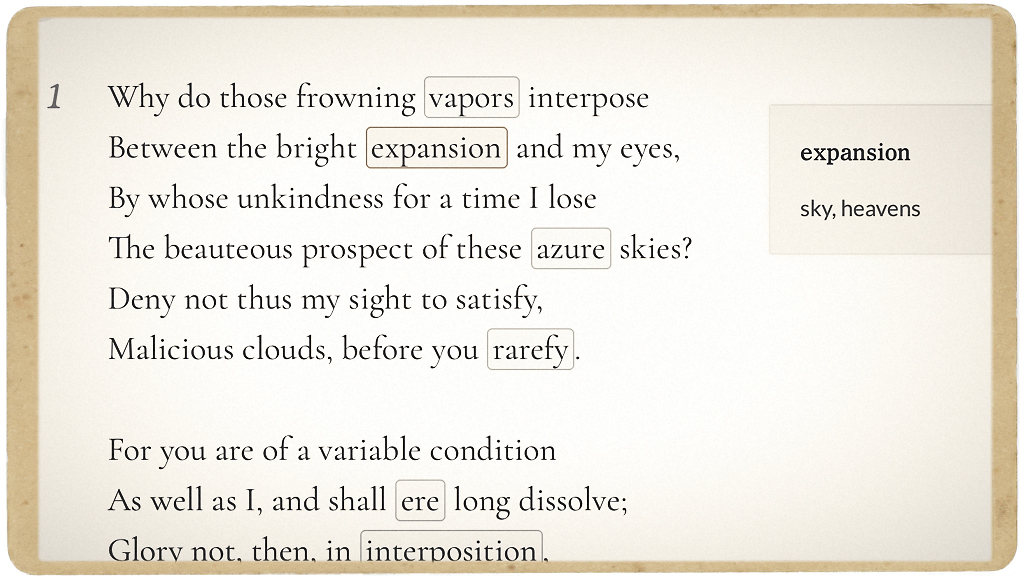
Sample note from "The Eclipse"

Editorial notes reside in the background until activated by the reader.

Amplified edition of The Eclipse

The amplified edition of “The Eclipse” differs from the elemental text, and also indicates critical notes…

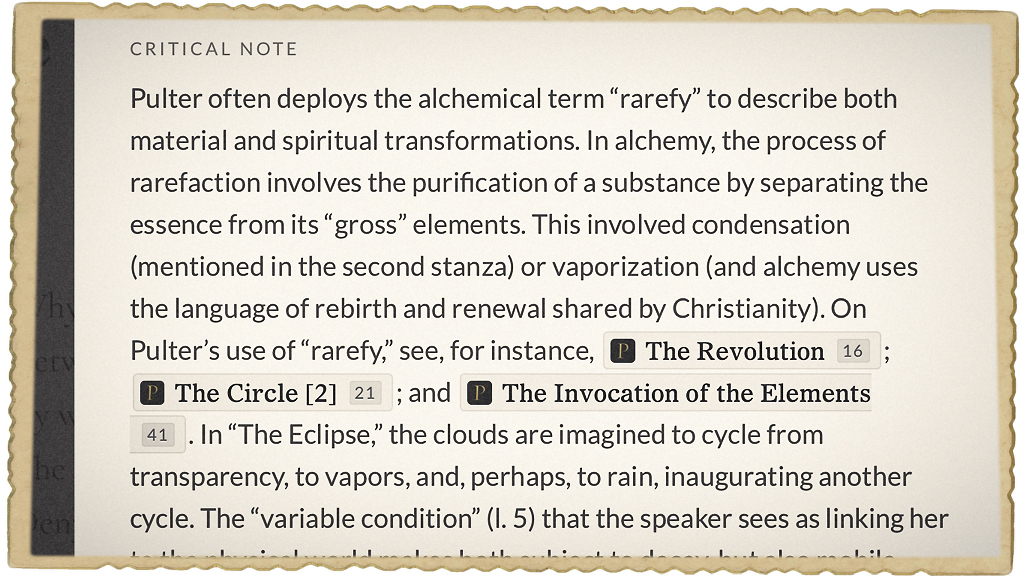
Critical notes for The Eclipse

…contributed by literary scholars, critics and editors.

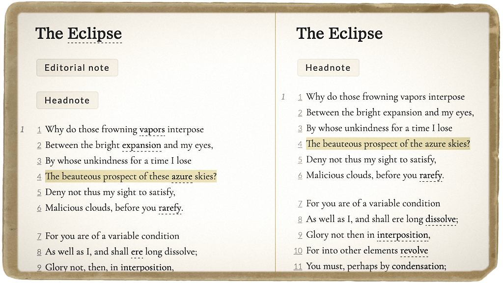
Version comparison tool

Different editions can also be compared side-by-side.

Accessibility for Everyone

By Lauren Tran

Everywhere we look, it seems that designers are thinking about accessibility — and that’s a good thing for everyone. On campus, we witness how automatic doors help not only those with crutches, but also those who are carrying heavy loads. Sidewalk ramps help those pulling carts and walking bicycles as well as those in wheelchairs.

Just as for physical accommodations, accessible designs in media technology and online environments have improved the experiences of all users. Artificially intelligent agents, like Siri on the Apple iPhone, make it possible for people to perform many useful functions simply by speaking. Computers, too, have improved accessibility with screen reading and alternative controls already built in to Windows and Macintosh operating systems. For all this progress, however, much work remains. As Northwestern’s Director of Assistive Technology, Jim Stachowiak, recently shared with The Daily Northwestern, “For people without disabilities, technology makes things easy. For people with disabilities, technology makes things possible.”
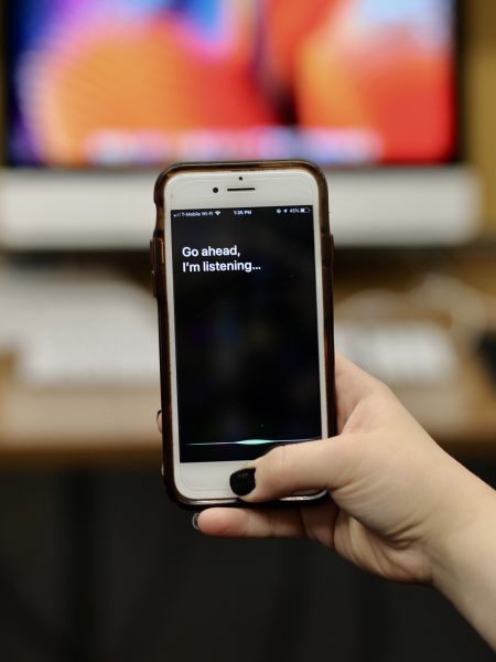
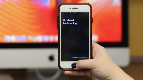
an iPhone showing Siri's listening capabilities

Using Apple’s Siri for voice commands

Furthermore, participating in the educational experience requires navigating a variety of spaces, physical and digital. How accessible are these online interfaces today? And how accessible do they need to be? What can we do to make course material accessible to as many people as possible?

Canvas is the center of online learning at Northwestern. Fortunately, it is designed for accessibility, containing many useful features such as support for screen readers, keyboard shortcuts, and quizzes that can be set for time-and-a-half.  Yet, while Canvas, itself, might be accessible, what about the course content that is uploaded to Canvas?

Myth: Digital = Accessible

One of the biggest misconceptions about online accessibility is that all electronic formats, such as PDFs and Microsoft Word documents, are automatically accessible. However, that is not the case.

Consider the steadfast PDF:

PDF (or, “portable document format”) documents are among the most common course materials uploaded to Canvas. Despite being digital, many PDF documents are not immediately accessible to those with vision disabilities, especially if those PDFs were made from scanners or photocopiers. Furthermore, while many can still read the documents, the documents can be frustrating because they are not searchable, nor can they be highlighted. Bad PDF.

What would it take to make these “bad” PDFs better? A huge and easy first step toward accessibility only takes a few minutes.

Adobe Acrobat offers the ability to pass these PDFs through a process called OCR, or optical character recognition. In this process, individual letters and words are deciphered by the software and stored as searchable and selectable content. This allows everyone to more easily find information in the document through search functions. Better PDF.
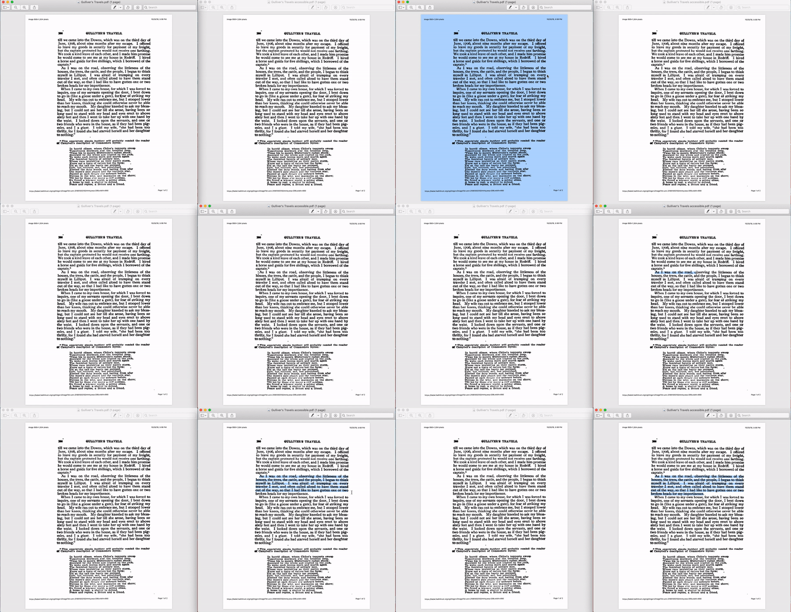
2 PDfS; the words in the first PDF can not be individually highlighted because the PDF has not gone through OCR processing. The second one allows individual highlighting because it has gone through OCR processing and is therefore, more accessible.

PDFs before and after OCR processing

OCR processing makes PDFs readable but not 100% accessible. According to Jim Stachowiak, further steps including “tagging, adding headings, adding alternative text to pictures and graphs, and making sure that the reading order is correct” are all required to make a document fully accessible. Great PDF.

Making content accessible can have benefits for everyone. But it is also the law!

The Americans With Disabilities Act (ADA) makes clear in Title II that communication with people with disabilities need be as effective as communication with people without disabilities. Title III mandates that there be public accommodations of people with disabilities which includes making digital spaces accessible.

At Northwestern University, it is imperative that digital spaces are accessible to everyone. In 2017, the New York Times reported on several colleges in New York that faced lawsuits due to inaccessible web content. These proceedings have been a wakeup call to higher education institutions to consider the accessibility of all websites and digital interfaces.

Accessibility: A Team Effort

Making the campus physically and virtually accessible requires a team effort. AccessibleNU works to ensure that all students have “full participation, equal access, and reasonable accommodation.” AccessibleNU works with partners such as Facilities Management to make sure that students can easily maneuver Northwestern’s buildings and with Northwestern’s Student Affairs IT to ensure that students can easily use the digital facilities that Northwestern provides.

AccessibleNU also provides guidance to campus technology units like the Media and Design Studio and Northwestern Information Technology when designing web interfaces and purchasing technology platforms. One such recommendation is to follow the Web Content Accessibility Guidelines (WCAG) 2.0, developed by the W3C.

AccessibleNU sets standards for faculty who are required to provide or arrange  accommodations for registered students. Usually, this means making sure course materials are accessible and working with AccessibleNU to make course and content modifications as needed. Together, AccessibleNU and faculty ensure that students with or without specific disabilities are treated equally.

Improving Course Materials

Beyond the need to respond to specific cases, Northwestern faculty can improve accessibility of materials in broadly applicable ways to benefit all students. Here are some examples:

PDFs: As previously mentioned, faculty can improve PDFs that are scanned documents through optical character recognition (OCR) in Adobe Acrobat.Through the “Recognize Text” tool, documents become searchable and selectable. While the results are not always as good as a “born digital” PDF that came from Microsoft Word, the extra effort leads to a significant improvement in usability.

Microsoft Documents: Authors can take advantage of Microsoft Word “styles” to distinguish between headings, body paragraphs, emphasized information, and other categories of text to make it easier to navigate documents. The “styles” tool allows screen readers and other accessibility tools to better process the structure of information contained in the document. As a side benefit, the consistent use of styles makes it very easy to elegantly change the look and formatting of documents.

Canvas Pages: Similar to Microsoft Word, heading and paragraph styles can help establish the structure of Canvas pages, making them easier to navigate. The rich content editor also offers faculty the option of providing “Alternative Text” that works as a supplement or replacement for images.
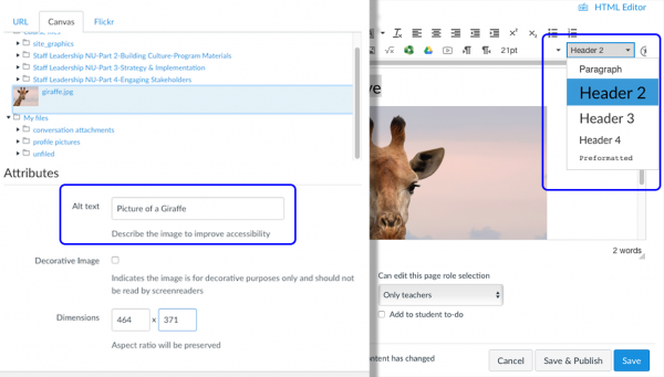
Screenshots of where Canvas users can write alternative text for images and choose text styles for pages

“Alternative Text” and “Styles” tools on Canvas

Video: Sites like YouTube offer closed-captioning functions for videos and the ability to narrow search results to only videos that include captions; however it is important to keep in mind that YouTube’s automatic closed captioning is far from perfect —accuracy can be as low as 60-70%. Faculty should make sure to check that the captions are correct. Both YouTube and Northwestern’s Panopto video tool support uploading transcript content with videos to make videos accessible without sound, and searchable for certain words or phrases.

Taking the Next Step: Workshops

Making accessible materials is easier than one might think, but sometimes the difficulty is in knowing how to take the first step. The Media and Design Studio has partnered with AccessibleNU and Information Technology Teaching and Learning Technologies to develop and offer a series of workshops offered throughout the academic year. These workshops focus on the challenges that students face while using digital interfaces and walk through some of the solutions that faculty can offer for PDFs, Microsoft Word documents, PowerPoint presentations, and videos.

Introduction to Accessibility

Thursday, October 18, 3:00-4:30 pm in Kresge 2524
Monday, October 22, 3:00-4:30 pm in Kresge 2524
Tuesday. April 16, 3:30-4:30 pm in Kresge 2524 Register here

Enhancing PDF Accessibility

Thursday, November 8, 3:00-4:30 pm in Kresge 2524 Register here

Improving Microsoft Word and PowerPoint Documents

Thursday, January 24. 3:30-4:30 pm in Kresge 2524 Register here

Accessible Video Captioning

Thursday, April 25, 3:30-5:00 pm in Kresge 2530 Register here
 

Telling Refugee Stories

By Matthew Taylor

Project Profile: Notunterkunft

Last spring a group of twelve Weinberg students traveled to a refugee shelter in Berlin to conduct research at the Notunterkunft Wilmersdorf, a World War II-era government building repurposed to accommodate the influx of displaced families from Syria, Afghanistan, Iraq and elsewhere. The students were enrolled in an advanced German course taught by Franziska Lys, who challenged them to inquire into lives almost unimaginably different than their own.

“Students need to know about diversity all over the world,” Lys said. “They need to understand their own backyard, but they need to contribute to that diversity in a more global sense.” Students interviewed refugees in German, English and Arabic. They also volunteered at the shelter, assisting with childcare and custodial chores.

One compelling outcome of that experience is Notunterkunft, a bilingual collection of digital stories, which Lys and her students assembled in collaboration with the Media and Design Studio. These stories are derived from a combination of interviews and immersion research, and take multiple forms that go beyond the page. Students crafted essays enhanced with sound and image, short documentaries, even a collection of plays.

What these stories depict is, at times, harrowing.

In a graphic memoir by Courtney Chatterton, a Syrian child regards a sturdy structure made of Legos as something invariably ruined, with lives cut short. Yet the Notunterkunft project is not without some room for hope. In a podcast produced by Maya Daiter, entitled “A New Life,” we meet Hayat, a Syrian woman expecting her first child. As she receives prenatal care at the shelter, there is no mistaking her determination to build a better life.

To realize this multiform digital project, the Media and Design Studio supplied equipment for students to document their experiences, including field recorders, lights, cameras and other gear. We also sent our instructional technologist, Cecile-Anne Sison, to Berlin, to provide project-specific training and logistical support. Cecile shot and produced this video, which, in addition to serving as a mosaic of student experiences at the Notunterkunft, rather wonderfully complicates one’s definition of the word refugee. Lastly, MAD Studio developer Sergei Kalugin conceived and developed the Notunterkunft website with assistance from Lys and her students, ultimately delivering a sensory-rich and intellectually rewarding record of this era-defining story.

* * *

Write-On Surfaces in the MAD Studio

By Matthew Taylor

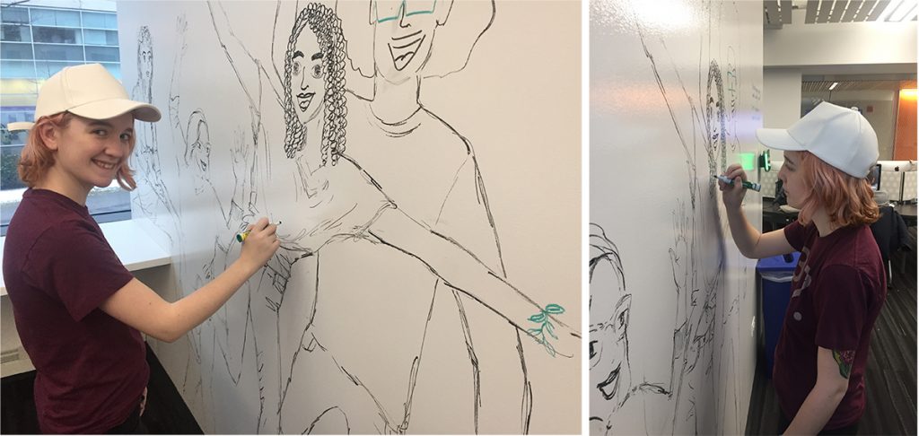
Many of you know that both you and your students can reserve small meeting spaces in the Studio for tutoring, group study, or team meetings. But did you know that you can now write on most of the wall surfaces?  Over break, we painted several walls with “Activity Paint.” These vast writing surfaces allow for highly creative and collaborative diagrams, think maps, grammar explanations, or any other impromptu drawing. For those who don’t have dry erase markers handy, we offer them for check-out at the front desk.

Game, Set…Learn?

By Madhurya Manohar

What do classrooms and workplaces today now have in common?

Gamification.

While the lure of games has been around forever, its use as a tool of engagement only began to gain traction seven years ago. Since then, it has transformed into a buzzword for the classrooms and workplaces of the future. But how much do we really know about gamification and how important is it for educators today?

So keen is the interest in the topic that last month, Cecile-Anne Sison from the Media and Design Studio, Susanna Calkins from the Searle Center, and Kelly Roark of Northwestern IT held a workshop for interested faculty on how to engage students through gamification. Participants were invited to create their own fun avatar and award stars based on different parameters as introducing themselves to others or asking insightful questions. The workshop spoke to the benefits of gamification, design processes and strategies, and examples of successful gamification in education.

Gamification, a term coined by British computer programmer Nick Pelling in 2003, is the process of integrating game-like elements in a non-game setting so as to encourage participation. It can include a variety of elements common to gaming psyche such as:

  • Achievement through points, badges, leveling and leaderboards.
  • Rewards through collectibles, bonuses or power-ups.
  • Time through a countdown to create a sense of urgency.
  • Personalization via avatar selection and customization.
  • Micro-interactions (toggles, special effects and animated rollovers to round out the experience.

Gamification has had some interesting applications in recent times. In the aftermath of Hurricane Sandy in 2012, digital agency, Mother, partnered with video game developer, Zynga, to create Repair the Rockaways. Players could purchase virtual bricks and watch how shattered houses in Rockaway, New York were reconstructed through their donations. To encourage active content engagement, digital media website, Mashable, created the gamified platform, Mashable Follow, that allows readers to customize their news consumption and earn badges for sustained participation. In another example, a nonprofit collective, Live58, launched Survive125, a poverty simulation where users virtually experience a day in the life of a 26-year-old bricklayer from India who lives on $1.25 a day.

The versatility and applicability of the technique is perhaps what has drawn educators towards gamification as well. Today, school and university classrooms are filled with students from the so-called Generation Z – or iGeneration – the first generation to be born into the digital world. With their 8-second attention spans, sustained engagement is crucial for a productive learning experience. How can teachers and faculty gamify classrooms in an ever-changing landscape?

Wendy Hsin-Yuan and Dilip Soman, of the University of Toronto’s Rotman School of Management, outline several considerations in  A Practitioner’s Guide to Gamification of Education.  Educators must establish the context in which students are being taught, whether pertaining to group size, time period or similar factors, in order to diagnose pain points in the learning process. Next, instructors should define objectives and structure the learning experience into stages. This blueprint should help identify what kind of elements will be integrated, such as:

  • A tracking mechanism where a student’s progress can be measured
  • A currency that illustrates what the student achieves by completing a stage.
  • A level which defines each stage and how much currency is needed to get there.
  • A rule set because the games need to be structured.
  • A feedback mechanism.

In approaching the final gamification of the course, educators can focus on self-elements that encourage students to focus on their own learning or social elements where students are engaged with the classroom community. It is important to note that gamification does not only imply teaching through the use of games. Rather, to gamify a class or a course can also include adapting the entire class format to a game, where the elements mentioned above come in.

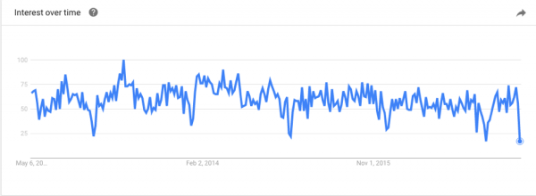
A graph illustrating online search patterns for the term ‘gamification’ over the years, via Google Trends.

On the Northwestern campus, gamification has had an interesting history. In 2013, Max Dawson, a former professor of the Radio, Television and Film department, designed a gamified class to explore the impact of reality television on the American television industry. Titled The Tribe Has Spoken – Surviving TV’s New Reality, the class included elements such as student ‘tribes’ who could win immunity challenges and scavenger hunts mediated by the class Twitter feed. In fact, Dawson himself went on to be a participant on Survivor in 2015.

Today, gamification has adopted another familiar avatar on campus: YellowDig, the online social learning network Northwestern adopted last year. The platform essentially enables students to engage with course material outside of the classroom, through posting articles, text, photos, videos, etc. CEO and founder Shaunak Roy built the system on the belief that ‘colleges and students would be interested in a platform that combines academically relevant content with features they are familiar with from Facebook and Twitter.’ It uses a points/ vote system as a gamified element to incentivize students to participate. Since the 2015-2016 pilot spearheaded by Medill School of Journalism professor, Dr. Dan Gruber,

More than 100 courses/learning communities comprising of over 2500 professors and students from across the university have used Yellowdig, who collectively have shared more than 8,300 learning stories and 26,000 comments & votes on the platform”

Gamification has certainly cemented itself in mainstream consciousness with its application in fields such as education, health and even community service. With the increased emphasis on hybrid learning penetrating classrooms today—and, not to mention, an urgent push to keep our digital natives involved and interested– it seems like it is here to stay for a while.


The International Reel

By Madhurya Manohar

The Oscars are upon us—the culmination of the glitzy awards season that ultimately crowns the best films of the year. Among the various contenders, the Academy of Motion Picture Arts and Sciences selects one film that is produced abroad to win Best Foreign Language Film. With notable films such as La Strada, 8½, and Life is BeautifulItaly has fared well in this category, with 14 winning films and 31 nominations over the years. This year, films from Iran, Germany, Sweden, Denmark and Australia have received nominations.

Watching these films can not only expose you to the creative cultures of other countries, but they can also be great media for gradually picking up nuances of a language. While we await the grand winner on Sunday, here are some pieces of creative brilliance that you can start with: Full post