Digital Humanities

Smithsonian features MADS Film Essay “INHUMAN FIGURES”

“The human can be redefined, and the future can be remade too. The question remains: in whose image?”

Michelle N. Huang

Over the past two years, the Media and Design Studio’s digital storyteller, CA Davis, has been working with English and Asian American Studies assistant professor Michelle N. Huang on the Studio’s latest film essay — INHUMAN FIGURES: Robots, Clones, and Aliens. Based on Huang’s research on Techno-Orientalism and the ways in which racial stereotypes pervade popular American films and television, INHUMAN FIGURES is now streaming as part of the Smithsonian Asian Pacific American Center’s online exhibits. You can watch it at https://smithsonianapa.org/inhuman-figures/.
INHUMAN FIGURES examines three popular science fictional archetypes—the robot, clone, and alien—and illuminates the racial logics and histories that underpin them—namely, the tireless worker, the indistinguishable copy, and the forever foreigner. By bringing to light lesser-known and forgotten histories, Huang shows how sci-fi futures are built on the backs of “humans that have [always] been less than human.”
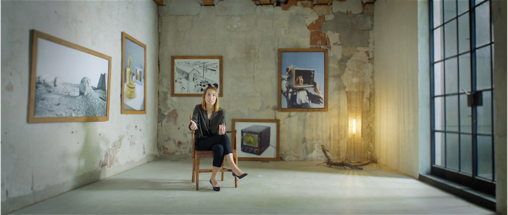
Assistant Professor of English and Asian American Studies, Michelle N. Huang

Breaking down examples of popular films such as Ex MachinaCloud Atlas, and Arrival, the film essay makes visible how these racialized tropes are utilized in the process of U.S. nation-building and future-making. And while popular film and television provides plenty of material to critique, few offer an alternative vision. “There is a limit to how many times you can see naked Asian American clones be thrown in an incinerator without feeling dehumanized yourself,” comments Huang.
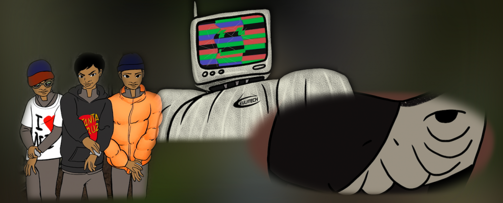
the film’s titular characters — top, robot; left, clones; right, alien

In order to fill the visual gap between the overused stereotypes in dystopian films and the possibilities of reparative speculative futures, the production evolved to incorporate the animation of three independent artists: Chicago local Keith Couture, and Evanston sisters Brittney and Crystal Galloway of the indie animation house, Sleepy Gallows Studio. Much of the production was spent conceptualizing, planning, and iterating the eight minutes of original animations based on a story arc that peels away the facades of these future beings in order to reveal the people living under their masks—no small task for a three-person art team.
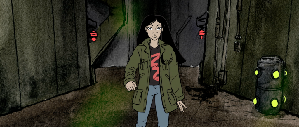
our Asian American everywoman, Emi, discovers the people beneath their scifi facades

And while the film dissected such racial stereotypes about Asian Americans head-on, it is notable that the production team of INHUMAN FIGURES itself reflected the multiracial coalition building that coalesced throughout 2020 amidst a surge in the Movement for Black Lives against police brutality and racial violence. The team’s animators, Brittney and Crystal Galloway, are themselves representative of a burgeoning wave of Afro-Anime enthusiasts whose work is directly inspired by the decades of rich, hand hewn Japanese animation.

“Working on this project has reminded me that there are other ways to animate,” Brittney Galloway reflected. “I was trained in the traditional American way and many of the teachers looked down on anime. The mixing of frame rates is much more common in Japanese animation as they are still experimenting as opposed to the West where it’s ‘perfected.’ While there are shots I wish I had more time on, overall, I don’t think the production suffered. In my future endeavors, this project will be a reminder that there’s always a way to make things more practical without sacrificing too much quality.”
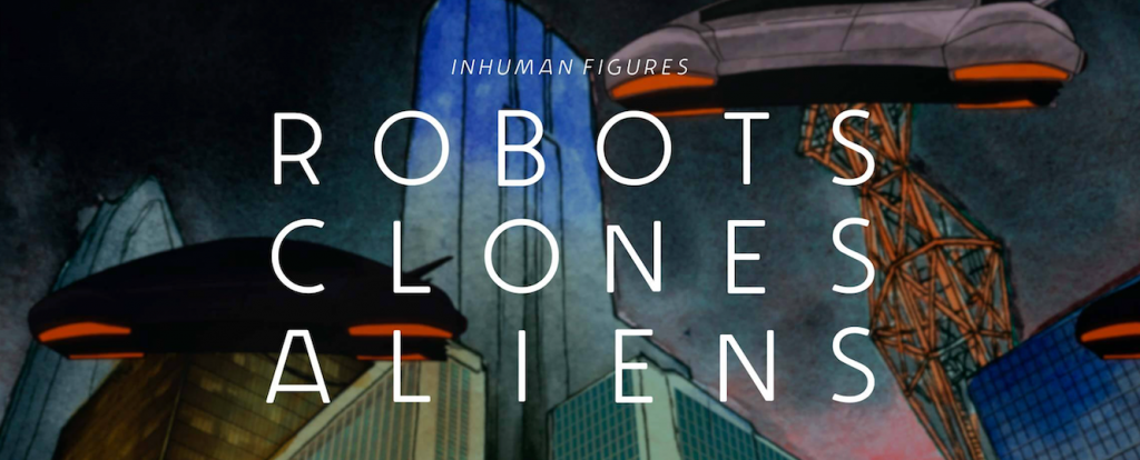
banner image from Smithsonianapa.org

INHUMAN FIGURES is a 24-minute film accessible free of charge via the Smithsonian’s Asian Pacific American Center online exhibit. Visit the exhibit here:https://smithsonianapa.org/inhuman-figures/

Reading the City and Telling its Story in Alternative Forms

For several years, Classics professor Francesca Tataranni has guided students in developing their own video-driven essays and map-based walking tours in her acclaimed ‘Ancient Rome in Chicago’ course.

Now, the Media and Design Studio is honored to unveil her latest work in conjunction with the studio, an exploration of her own, titled “One Dark Wall”

Since 2015,  Francesca Tataranni (Charles Deering McCormick University Distinguished Professor of Instruction of Classics and Director of the Latin Program) teaches her course, Ancient Rome in Chicago, a seminar that asks students to use Chicago—it’s buildings, it’s concrete, it’s public art—as a resource for the film essays they make throughout the quarter. For the past five years, Francesca’s students have helped create a virtual walking tour of Chicago’s buildings that utilize classical, Roman architecture. Francesca often called on the expertise of the Media and Design Studio to help teach best practices and styles when creating these film essays. But, in the winter and spring of 2020, Francesca collaborated with the Media and Design Studio’s digital storyteller, CA Davis, to create her own film essay on a controversial mural in Lincoln Square’s Sulzer Library.

Several years prior, Francesca found herself surrounded by four walls covered with raw paintings of a visual interpretation of Virgil’s Aeneid. What struck her wasn’t the sheer amount of work that Irene Siegel put into the murals in 1985 but the dark, gastly depiction of the underworld on the entrance wall that stands in opposite to a fire and brimstone depiction of the Trojan War.

“Seeing the Dark Wall for the first time was truly overwhelming,” Francesca recalls. “I remember surveying the wall over and over again from all directions in an attempt to make sense of the shattered quotes and anguished images that cover its entire surface. The more I looked, the more frustrated I grew.”

And it turned out she wasn’t the only one who was taken aback by the mural’s visceral imagery.

Irene Siegel painted her interpretation of the Aeneid in 1985, right in the middle of the Reagan administration—a time which, Francesca discovered, influenced the painting as much as the public’s reception of the work itself. Over the following months, Francesca unraveled the painful story of Irene’s months-long battle just to finish the mural amidst severe outcry against her visual style and personal attacks as an artist. When thinking about how to relay this story, Francesa first wrote the story into a research paper which compared the mural’s visuals with the original text. What she revealed was how Irene Siegel’s feminist reading of the Aeneid is portrayed in the figure of Dido, who Francesca calls, “the true hero of the Aeneid.”

When Francesca approached the Media and Design Studio, she did so with two intentions. The first was to create a visual essay based on her written work surrounding the mural in order to accurately portray the painting in the context of her feminist, political reading of Irene’s art. The second was to learn what it takes to professionally develop such a film essay so that she could use her film while teaching her students how to create their own. What followed was a months-long process of rewriting her essay into a scripted voice over narration, and multiple days of filming on location to re-enact her discovery and research of the mural itself.

“Working with John (Bresland) and CA (Davis) on the video script was an incredibly enriching and liberating experience. They showed me how to let go of some concerns and constraints that usually drive my writing of words on a page and allow visual and sonic elements to dance with the pen.”

The Media and Design Studio’s digital storyteller, CA Davis, was tasked with combining all these elements into a coherent, flowing story that accurately depicts the history, politics, and re-reading of Virgil’s original text in the light that Francesca shone. The result is the film essay entitled, One Dark Wall, which can now be watched via the link below.

In March of 2021, Francesca plans to use this film as part of the Department of Classics’ end-of-quarter event on the reception of classical works such as the Aeneid. You can sign up to watch that event via the link below.

https://planitpurple.northwestern.edu/event/572094

MAD Studio to Join Weinberg College IT Solutions

There are some some exciting behind-the-scenes organizational changes taking place at the start of the 2019-2020 academic year for the Media and Design Studio. We hope that these changes will enable new opportunities for growth and enhancement of our services, all while keeping the same commitment to our faculty collaborators, their manifold instructional support needs, and the continued development of innovative pedagogical and scholarly projects.

As the main part of its organizational change, the Media and Design Studio is shedding its legacy classification as an academic program and becoming an administrative unit that is fully connected to Weinberg IT Solutions (WITS). In many ways, this new classification better reflects the technical nature of the work that we do, and follows decades of existing partnership.

Although we are changing organizationally, our mission is the same. With a nod to our 50-year history that began as the Northwestern Language Laboratories, we keep our attention to the technological and pedagogical needs of language instruction, even as we bring many of the techniques and solutions originally pioneered in this area to the benefit of scholarly activities spanning the broader humanities.

In the new organization, I will continue to oversee the unit’s development, services, and support operations as Director of the MAD Studio. In this capacity, I report to Mike Satut, Senior Director of Information Technology for Weinberg College. Together, Mike and I look forward to identifying all of the ways our technology teams can nurture a helpful cross-pollination of ideas​ and improved sharing of resources.

Working with me in MADS is the same great team that has earned accolades for their professionalism and performance:

  • ​​​Cecile-Anne Sison, a leading voice on instructional technology and the focal point of the daily operations in the “lab”
  • ​Sergei Kalugin, the Studio’s lead developer whose design and engineering are behind all of the unit’s stunning web and mobile projects; and
  • ​C.A. Davis, a resident digital storyteller who has engaged with faculty to help them communicate their research and teaching to wider audiences

We are the same team, have the same mission, and so also do our services remain the same. For example:

  • ​​We offer customized technology enhanced teaching spaces with computers equipped for individual and group audio activities, videoconferencing equipment, and ultra-high-definition presentation systems. ​
  • Faculty can request cameras, audio recorders, or iPads for a course, receive advice on sharing audio or video with students, or simply check out a missing adaptor for their computer.
  • Our web and mobile development projects remain very much in progress, as are plans for support and upkeep. And, we eagerly await many more innovative and collaborative project ideas to come.
  • ​We offer workshops on various topics of interest to faculty and students, and stand ready to provide teaching assistance for digital tools and techniques in various courses.

We will endeavor to keep our services and support responsive to what is most valued or needed. And, with the help of your input and feedback, we anticipate continuing to​ update and enhance​ our offerings in the future.

For services and support, our e-mail contact addresses are the same:

  • ​Room reservations and questions: mads-rooms@northwestern.edu
  • ​Equipment reservations and questions: mads-circ@northwestern.edu
  • ​General inquiries, feedback and project questions:  madstudio@northwestern.edu

Please feel free to share requests, ideas, suggestions, or questions through these channels or with any of us personally!

The Pulter Project

On Building a 21st Century Reading Experience with a 17th Century Poet

In 1974, when The Riverside Shakespeare was published by Houghton Mifflin, the venerated two-volume collection of Shakespeare’s poems and plays was thick as a Tewkesbury mustard. The edition came loaded with extras. So many extras—in the form of notes, footnotes, critical essays, justifications for modernized language, photographic inserts and more—that Stephen Booth, reviewing the 2,057-page collection for the New York Review of Books, feared its monumental size “would cause iatrogenic malnutrition in students” and would be too heavy to carry to class.

Today, four decades and two editions later, many students of Shakespeare are still hefting that “big, ugly” Riverside like seven pounds of early modern flesh. Despite the bracing sticker price of $200, a great many professors, sold on the critical bona fides of those extras and lured by the convenience of everyone being on the same translucent page, require students to buy it.

Booth believed that Houghton Mifflin’s sales strategy—bundling critical notes pitched to faculty in order to tap the student market—positioned the student as a permanent outsider. The Riverside failed as an aesthetic experience, he wrote, because “its concerns are usually different from, inconsistent with, and invidious to the concerns of those who will read it.” It’s hard to make something good. Harder still when a crucial piece of that something is authored by someone else, for someone else.

Happily, there are technological affordances that enable us to meet literary figures on more intimate terms, free of editorial cruft. We can, for instance, build an edition around a poet whose life briefly overlapped with Shakespeare’s. And we can front that edition with contributions by critics and scholars—as did the Riverside. Crucially, though, we can make those notes and essays disappear with a tap, leaving nothing visible to the reader but the original ink-smudged manuscript. And we can make it free.

With The Pulter Project: Poet in the Making, edited by Wendy Wall and Leah Knight, developed by Northwestern’s Media and Design Studio, that’s what we did.

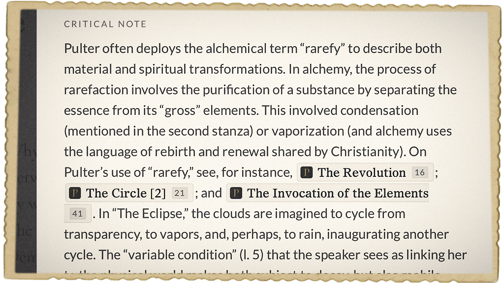
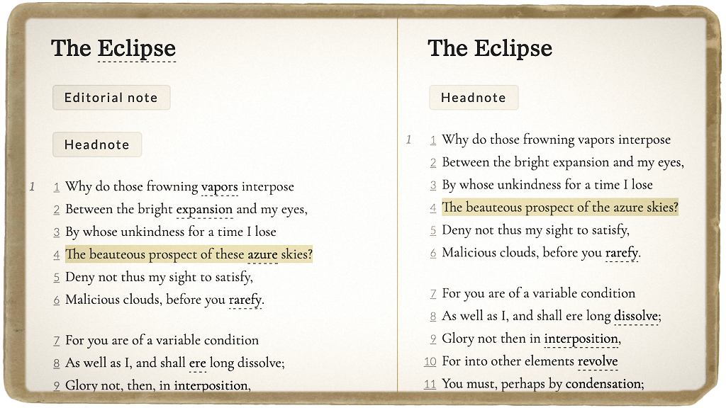
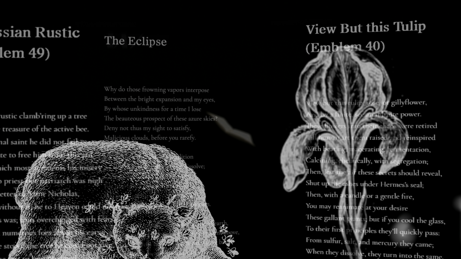
The Pulter Project is a digital collection of Hester Pulter’s poetry, engineered to adapt to the concerns of all who will read it. Readers seeking minimal interruption and basic editorial notes can activate a pared-down elemental edition, while those seeking additional context and commentary can enable the site’s editorially beefed-up amplified edition. The cumulative effect might be compared to visiting a museum that not only displays works on the wall, but gives us a chance to enter into that work, the making of it, the reception of it. The Pulter Project is also outfitted with a tool that compares editions side-by-side for a granular study in how poems evolve as they’re touched by different editors—as well as numerous other means of accessing the verse of this 17th century artist whose work was nearly lost to history.

Nobody seems to know a whole lot about the route taken by Pulter’s calfskin-bound manuscript before it was found by Mark Robson, a graduate student with a keen eye for verse, in a Leeds University archive in 1996. Prior to Robson’s recovery, the manuscript was owned by Gilbert Ingefield, a former architect and book collector who also happened to be the mayor of London. Ingefield auctioned off the book at Christie’s in 1975, when it was acquired by Leeds.

The Pulter Project interface was designed by Sergei Kalugin, a Russia-born developer who maintains exacting diets and competes in triathlons. “The initial design,” he says, “was based on the fact that the only real thing that we have here is Pulter’s manuscript. It’s the pillar. I was convinced from the very beginning that the reading itself should be the sole focus of the interface.” He notes that even printouts of the poems, the overlooked stepchild of screen-centric digital publishing, are intended to please the eye.

“Early on,” says Kalugin, “as we researched other digital editions, one thing struck me: the default mode for pretty much all of them was severe overload. I didn’t like that. I tried to avoid that overwhelming quality. With the Pulter Project, we wanted the user to feel comfortable doing one thing. Reading.”

Among the site’s more poignant features is access to scans of Pulter’s manuscript. There’s an inescapable intimacy to these hand-lettered pages. That this should be meaningful probably says more about our touchscreen era than anything else, when the mortal sweat of a made thing is routinely concealed from us. It seems not to matter that most of these poems were copied from earlier drafts by a scribe rather than Pulter herself (though corrections believed to be in Pulter’s hand are laced throughout the manuscript).

What does matter is that a reader today can glimpse how literature was made in the 17th century, before print culture dominated. Hint: it’s maybe not that different than the 21st century, when nearly all writers continue to rely on coteries of trusted readers, friends, and frenemies. This is one of many ways The Pulter Project argues, through its breadth of features—the ability to compare editions, the ability to offer multiple edits of Pulter’s poems in a way that’s transparent to the reader—that literature is rarely, if ever, the work of one.

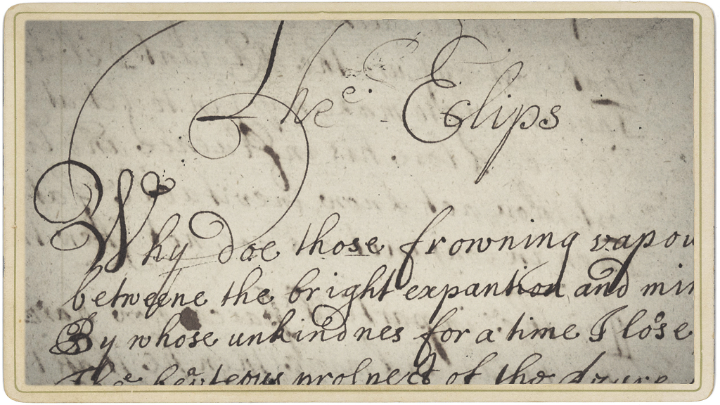
Partial scan of The Eclipse

Detail of “The Eclipse,” from Pulter’s manuscript, circa 1660.

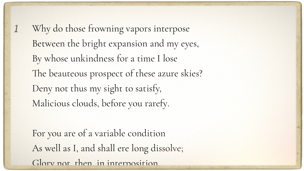
Elemental edition of The Eclipse, by Hester Pulter

Readers can view the elemental edition of “The Eclipse” for a minimalist rendering of the poem without visible editorial intervention.

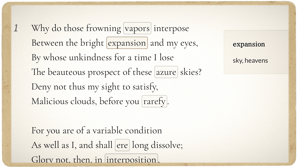
Sample note from "The Eclipse"

Editorial notes reside in the background until activated by the reader.

Amplified edition of The Eclipse

The amplified edition of “The Eclipse” differs from the elemental text, and also indicates critical notes…

Critical notes for The Eclipse

…contributed by literary scholars, critics and editors.

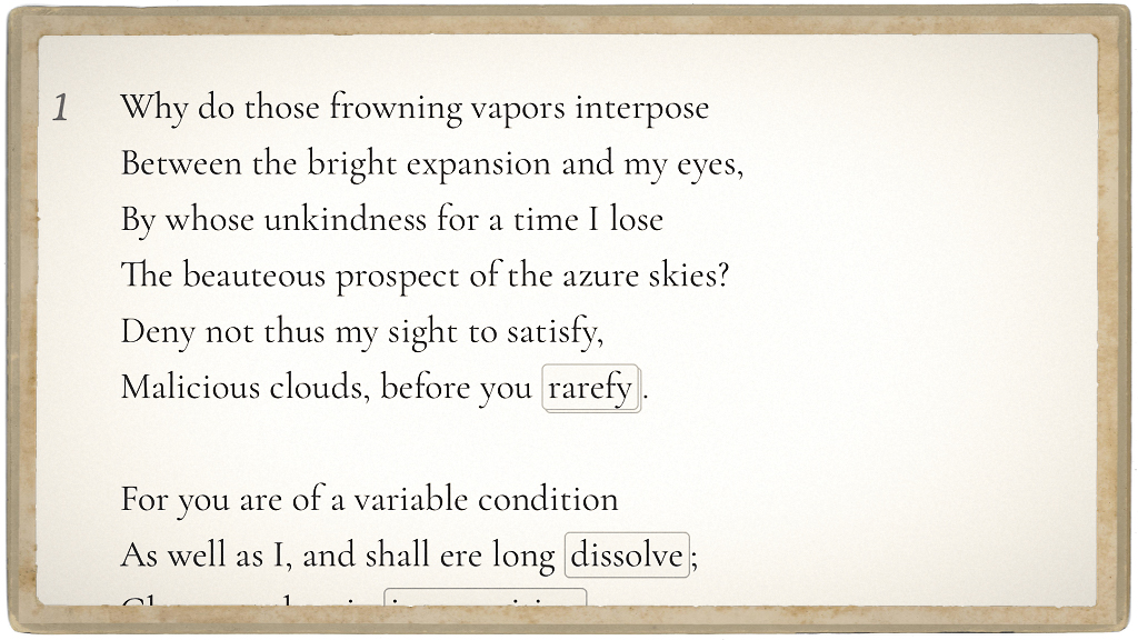
Version comparison tool

Different editions can also be compared side-by-side.

Humanities and Computer Science — What?

It’s holiday time. Time for big dinners, friends, family, and cheer. At the dinner table there might be those half-interested questions of “What do you do?” or “How is your work going?” This month, after attending the 10th annual Chicago Colloquium on Digital Humanities and Computer Science (DHCS), followed by an exciting talk by Mark Guzdial on how to boost society’s computer literacy, my response will be energetic and as clear as Ralph Parker asking Santa for a Red Ryder BB rifle : “Work has never been better! Increased access to tools and digital literacy are critical to scholarship and instruction of the humanities, and I’m happy to be a part of it!”

But it’s never that easy.

Full Post