This January, the MMLC welcomed Sergei Kalugin to join the department as a full-time Web application developer and designer after three months of working as a contracted consultant. Graduating with Masters Degrees in Economics and Business from Baltic State Technical University in St. Petersburg, Russia in 2008, Sergei has since held a number of web design and e-Commerce positions both in Russia and the USA, before turning his focus to the educational sector. Fluent in three world languages (Russian, English, and Finnish) and equally comfortable in the languages of design and programing, Sergei brings a valuable blend of talents to the MMLC’s courseware and research development initiatives.
While many of our faculty and student patrons may not have met him yet, they have most likely seen his design and/or programming work: whether on of our recent special event postcards, or in one of our most recent courseware projects. For this article, I asked Sergei about design and its role in the learning experience.
Matt: How has your time in the MMLC been? What kinds of projects have you been working on so far?
Sergei: Hi Matt, thanks for the introduction. I’ve had a wonderful experience working with the MMLC team so far. I find working in academia as a web developer and designer to be very inspiring and rewarding. It’s great to be in such a challenging environment here at Northwestern where I can help create and design web applications and other teaching tools for professors and students.
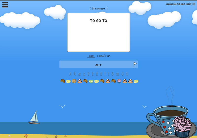
Sergei’s recently designed flashcard interface for Le français internautique found the right pastries, and interactivity to retain my attention.
One of the most engaging projects for me was helping to refine a flash cards component for “Internautique” – a learning tool for French language. Another great project I’ve worked on was developing a set of sites for the Northwestern Dictionary Project including new web application, “WildWords,” and wiki-based site “NeD”. I’ve also enjoyed working on the MMLC department’s branding elements, which included new postcard designs, graphics for our World.Wine.Web project, and conceptualizing a new design for the MMLC website.
Matt: Based on what you’ve seen, how important is Design in Web Development for Education? Do you feel that it is different than e-Commerce or Marketing?
Sergei: Very good question, Matt. Front-end development in education is very different. In marketing and e-Commerce, the eminent mantra for web designers and front-end developers is “Don’t make them think,” emphasizing the importance of effortless experience, transparent navigation system and predictability. According to this philosophy, the moment a user starts thinking is a few seconds apart from the moment he/she closes your page. Web development and design for educational purposes underscores the importance of “actual thinking,” which should be conceptualized and shaped into the design from the start.
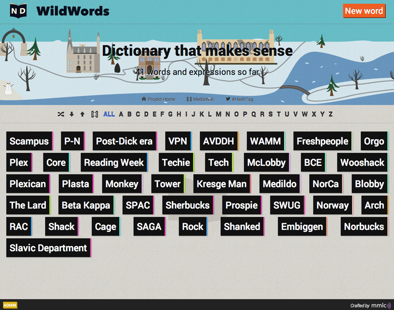
A Screenshot of the WildWords dictionary from the Northwestern Dictionary Project. See it online!
The ultimate goals of design for educational purposes versus marketing purposes are also very different. The goal of an E-commerce web site’s interface is to put you in a comfort zone where you know what’s going on and keep you there until you make your first/n-th purchase. For courseware, the user experience goal is to put you in your comfort zone at the very beginning and then occasionally get you out of it (but not too much so that you can process this discomfort), and then finally get you back in your comfort zone knowing/being able to do more than you did before.
One of the challenges of well-designed courseware is to break the chains of the default “consumerist” approach, as we see in many popular modern applications. One efficient and very effective technique to achieve this goal is through ‘gamification’ of the user experience—badges, achievements, social sharing component, lives, points, stories, motives etc. I think courseware creators should move in this direction, as it can be extremely beneficial especially for language learning. But to be honest, it isn’t always a good idea to add a motive or a “story” behind the design. So, I try to be reasonable and don’t turn every app into a game.
Matt: Concerning the variety of needs within education, how is the design consideration different for courseware (web sites that support learning) versus administrative systems? What needs the most work?
Sergei: What makes designing courseware for education unique compared to administrative systems is the need to design applications that support learning by designing from the student’s perspective and creating an educational experience. For example, MMLC works a lot with linguistics. And this adds certain needs to the interface design and user experience. Language is a very exacting material to work with, and yet the learning experience could benefit from certain educational tools that make learning languages easier, more enjoyable and even faster.
In my opinion, the development of mobile interfaces and user interface (UI) experiences (on touchscreen devices) should be at the forefront of near future initiatives. Yes, learning management systems or other courseware must have a comprehensive desktop version containing all features, but a mobile version of it should exist and be even better. We live in a world where it takes “too much time to open your laptop cover.” It’s easier for many students to activate their smartphones with a couple of swipes and touches, making smartphone the dominant device used for most action in today’s world. Of course there is classroom work and that should be different. But the idea of a non-stop or constant learning approach to education (which is crucial for language learning, in particular) requires immediate access to your courseware’s fine-crafted pixel-perfect interface from users’ mobile devices. And we have many good examples of smartphone-centered projects with quite impressive front-ends (Duolingo, Lumosity, Coursera App, to name a few) to be inspired with for future app development. Modern techniques and technologies do not make it as intimidating and difficult as it may seem to create a satisfying, educational mobile experience for your students.
Matt: What have you observed with respect to design and engagement so far? Has there been a result or reaction that did not anticipate?
Sergei: One thing I’ve observed is the challenge and difficulty to maintain a user’s attention when you’re trying to initiate a thoughtful response. I knew I had to have a better understanding of how the students were going to interact with the tools I design in order to create something valuable for them. It’s also been important for me to consider how a design works for the professors and faculty members using them. I didn’t expect so much diversity of thought and variety of opinions regarding how the same interface should behave.
Matt: What are some of your tenets or priorities as it concerns modern web design? Tips, tricks, and things you try to use, or things that you try to avoid at all costs?
Sergei: One of my main priorities is productivity. Nobody writes raw code these days. The world of front- and back-end development tools that the open source community offers is huge. Preprocessors like Sass, Haml, Coffescript or utilities like CodeKit truly make you a happier developer. So use them!
As for the use of frameworks and “just-add-water” solutions, I would recommend to be very careful. I believe there must be a balance between looking good, looking conventional and looking different. Since Twitter Bootstrap (the most popular front-end framework) was introduced, developers received a great tool, but half of the web now looks the same to me. Okay, maybe not half … [Sergei smiles]
Finding the right inspiration for a project is also very important. I often turn to other websites, contests, blogs and thematic sites for inspiration. There’s nothing wrong in looking for inspiration in other people’s work I think, but the final product should bring something unique—this is how this world evolves.
To understand users, every designer should also evolve as a psychologist, ergonomist, physician, et al, which makes reading appropriate studies and articles a necessary component for growth in the field.
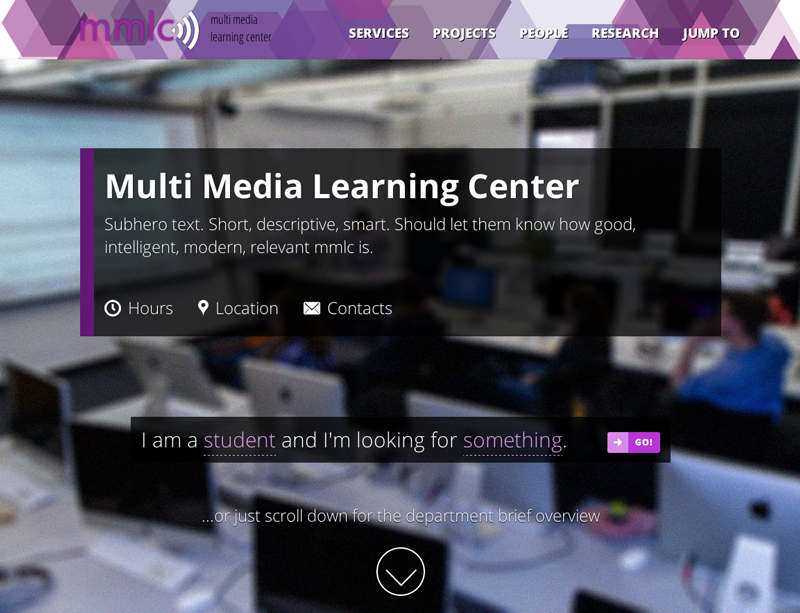
The design and implementation of the MMLC’s upcoming departmental page redesign is a highly collaborative process.
There are some things that I try to avoid, including making final decisions without getting a second, third, or even fourth opinion first. It’s extremely difficult to stay objective when you are the only one looking at your design work, even when you work within a team. That’s why I really appreciate usability testing—this is a very important thing to do. Luckily we have so many testers (aka students) here at Northwestern to help.
Finally, I try to avoid the thought that I’ve finally got it, that “eureka” moment. It’s extremely hard to predict how your users will interact with the design and interface that you have created and there are truly no limits to perfecting a project.
Matt: Thank you, Sergei!
Indeed, Sergei has been a very welcomed addition to the MMLC team, and we’re happy that he has decided to join us. We have lots of interesting and visually compelling projects in our development queue: a new website, expanded interactivity types in our online courseware projects, and growing support of digital humanities scholarship. We look forward to sharing more of these developments — and Sergei’s future blog entries — with you soon.

