
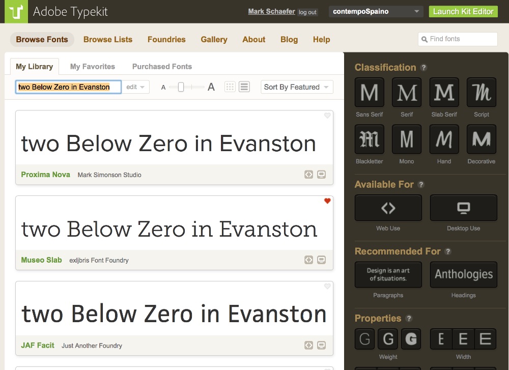
The “original” front page of the insurance exchanges site in fall of 2013.
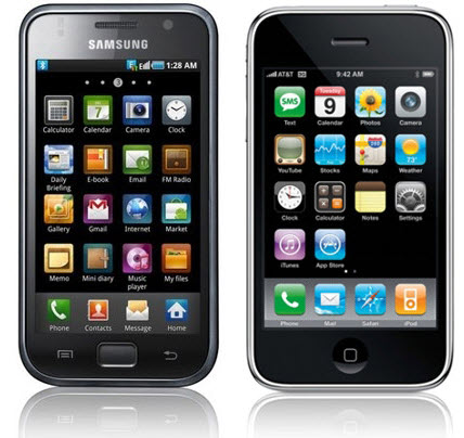
Hmm. Which one is the iPhone? Hint: it is not the left one.
The word “design” seems to be used more as a noun than a verb in the last decade or so.
The “design” of the website for insurance exchanges, HealthCare.gov, was a big issue last fall, as it interfered with signing people up for healthcare.
Court rulings on whether or not Apple’s “design” for the iPhone was copied by Samsung have made headlines for several years as the trials wend their way through the courts.
Design has come to be affiliated with a kind of “personal” style. Adopting the “look” of Ralph Lauren’s clothing, or the look of Gucci or Levis, or Old Navy says something about you, and how you want to be viewed by others. Some would never wear Gucci and Old Navy at the same time. Some people would never wear Gucci, period.
You get the idea.
Can the same be true of documents, and web pages and PDF files you create? Is there “fashion” in fonts? Or at least better at doing their “job” than other fonts?
As our lives become more mobile, the communication we employ with others is less and less face-to-face, and more often via text: Facebook posts, emails, Word docs, Twitter feeds.
If your designer clothes “say” something about you to the world, something that shows you took time to assemble, and think about, and care for how your clothes look on you — what does the “design” of your communication look like? And does it aid your work as an educator? Or does it detract from it?
Real-life Font-tastrophe
In 2012, a “trick” op-ed in the New York Times tasked readers to answer a survey matching a reader’s level of agreement with statements made in the op-ed. The trick subtly designed into the survey was this: will people believe statements more or less if the Times displays them using different fonts?
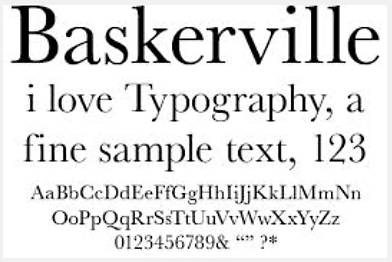
A typography sample of Baskerville, a font created in 18th century England.
The results (revealed in “Hear, All Ye People,” a second Times op-ed that disclosed the ruse) showed people had a much higher opinion if the display font was Baskerville (a nineteenth century font from England) than if the statements were displayed using the often mocked Comic Sans (invented by Microsoft in the early 1990’s). Remember this was not a survey asking if you like this font or that font. It was a survey that attempted to see what level of veracity might be associated with a font.
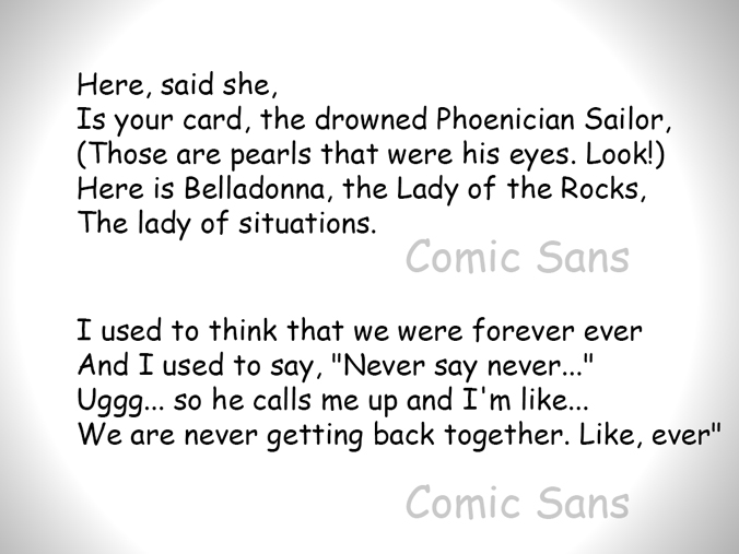
On top is TS Eliot’s “The Wasteland.” Beneath is Taylor Swift’s lyrics to “We are Never Getting Back Together Again.” Both are set in Comic Sans. These very different verses are used together to minimize the effect the meaning and/or significance of the words might have on the display font.
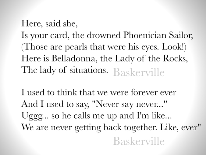
Again, TS Eliot’s poetry and Taylor Swift’s, er, ah, lyrics about breaking up. This time, the font Baskerville is used. Baskerville was created by John Baskerville in the 1750’s at his print shop near Birmingham, England.
Font “Secrets”
In 2006, Canadian grad student Phil Renaud revealed in a blog post called “The Secret Life of Fonts” that over the years the essays and papers he submitted were getting different grades.
Wondering why, he searched his files for the graded papers and exams in storage. Looking at the printed pages, he realized the lower-grade papers were printed using Trebuchet, and the highest grades consistently came on papers printed in the font Georgia! The range went from B-minus to A! Enough to make a difference on what grad school you get into, if the schools weight grades and transcripts highly.
What was the difference? The higher grades correlated to his changing fonts on his computer! Trebuchet gave him the lowest scores, and Georgia gave him highest scores, with Times New Roman (the default font for new documents in Microsoft Word) following in second place.
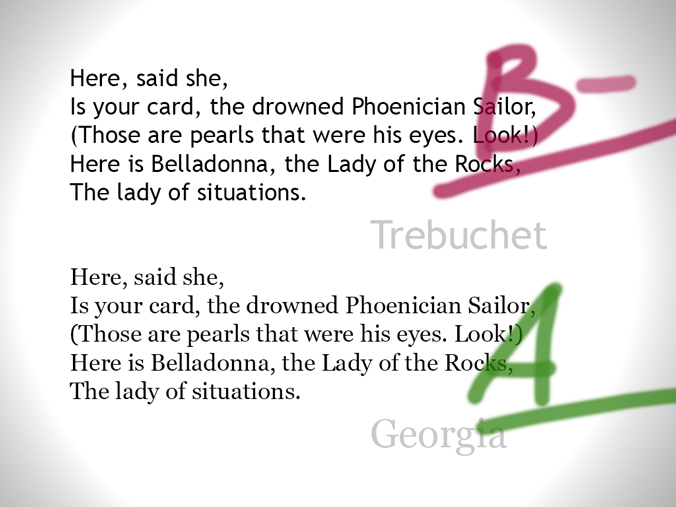
This is an illustration of what Canadian grad student Paul Renaud concluded after he analyzed his exam papers over the years. He thought the reason some were given an A and some were given B grades had to do with which font he used in the paper.
Certainly this is anecdotal at best. The post is no longer live on the web though it has been reposted on Renaud’s personal site, Riot Industries. I found the original text in the Internet’s storage locker, web.archive.org. (Here is a link to the text.) Would YOU want to take a chance getting a B-minus when you could get an A? And all by simply changing the font in your word processor?
The Higgs Boson announcement, the discovery of the “God” particle, was presented to the world using Comic Sans. As a geek myself, I have to admit I could not believe it at first. It is hard to think that this could happen — that one of the great advances in modern science was revealed to the world in a cartoon font. It was used, as one of the researchers revealed, because they liked that font.
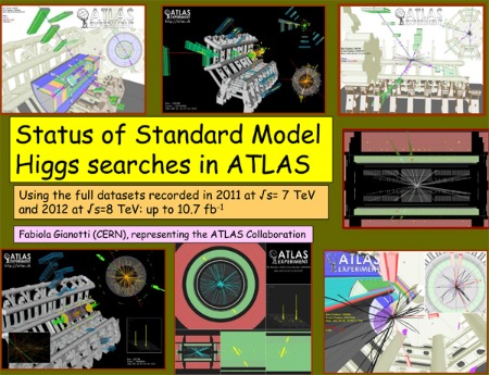
This is an actual slide from the CERN presentation that described the discovery of the Higgs. Comic Sans was the font of choice by the researchers.
After the recent Pope Benedict resigned the Papacy, the Vatican released a photo album showing the Bishop of Rome through his years as pope. And the captions for the photos? Comic Sans, of course, even the Latin.
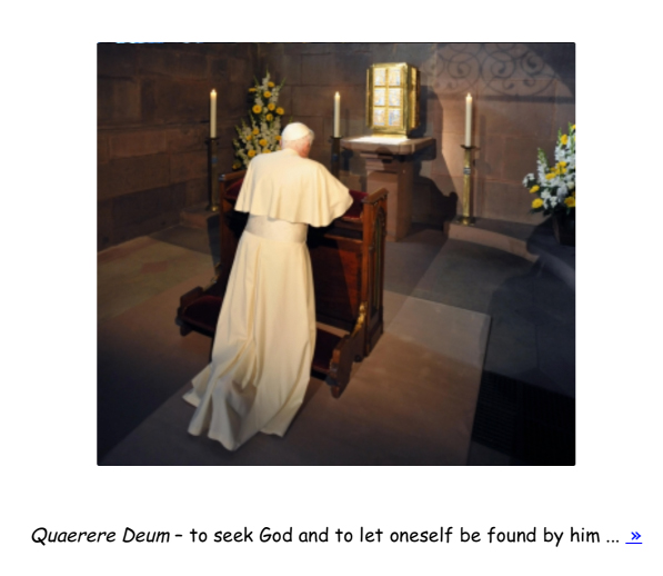
The Vatican website created a photo-album to commemorate the reign of Pope Benedict. The descriptions are in Comic Sans.
Don’t think I am mocking particle physicists, nor the Vatican, nor even Comic Sans. The short-writing site, McSweeney’s Internet Tendencies, has done all the Comic Sans mocking needed, in a wildly funny “imagined monologue” in defense of Comic Sans. (Those sensitive to rough language should be very warned: it’s very rough.)
So it’s evident that just as there are fashion faux-pas, and increasingly, there are font faux-pas in the online world.
But that is not the point here. This is not an exercise in vanity, but an exercise in veracity.
The CERN Higgs Boson team was roundly mocked when the slides in Comic Sans were presented. Even Vincent Connare, the designer of the Comic Sans font, tweeted to a British particle physicist “What’s with the [expletive] slides?”
And the Vatican photo album? There are some who would say the use of Comic Sans “humanizes” the former church leader.
OKAY. I won’t use Comic Sans.
Unless I am writing a comic strip. But Times New Roman is also out. Arial is out. They have been over-used for years because they are the default fonts found in the early versions of Microsoft Office.
Designing communication is more than just choosing fonts. It is arranging words and shapes in ways that people can see, assimilate, understand, and retain. The Dutch designer Erik Van Blokland gave a great talk at Beyond Tellerrand 2013 about just this aspect of design. Very heavy in physics and eye mechanics in the start, but hang with him, he has amazing points to make. (Link on Vimeo.)
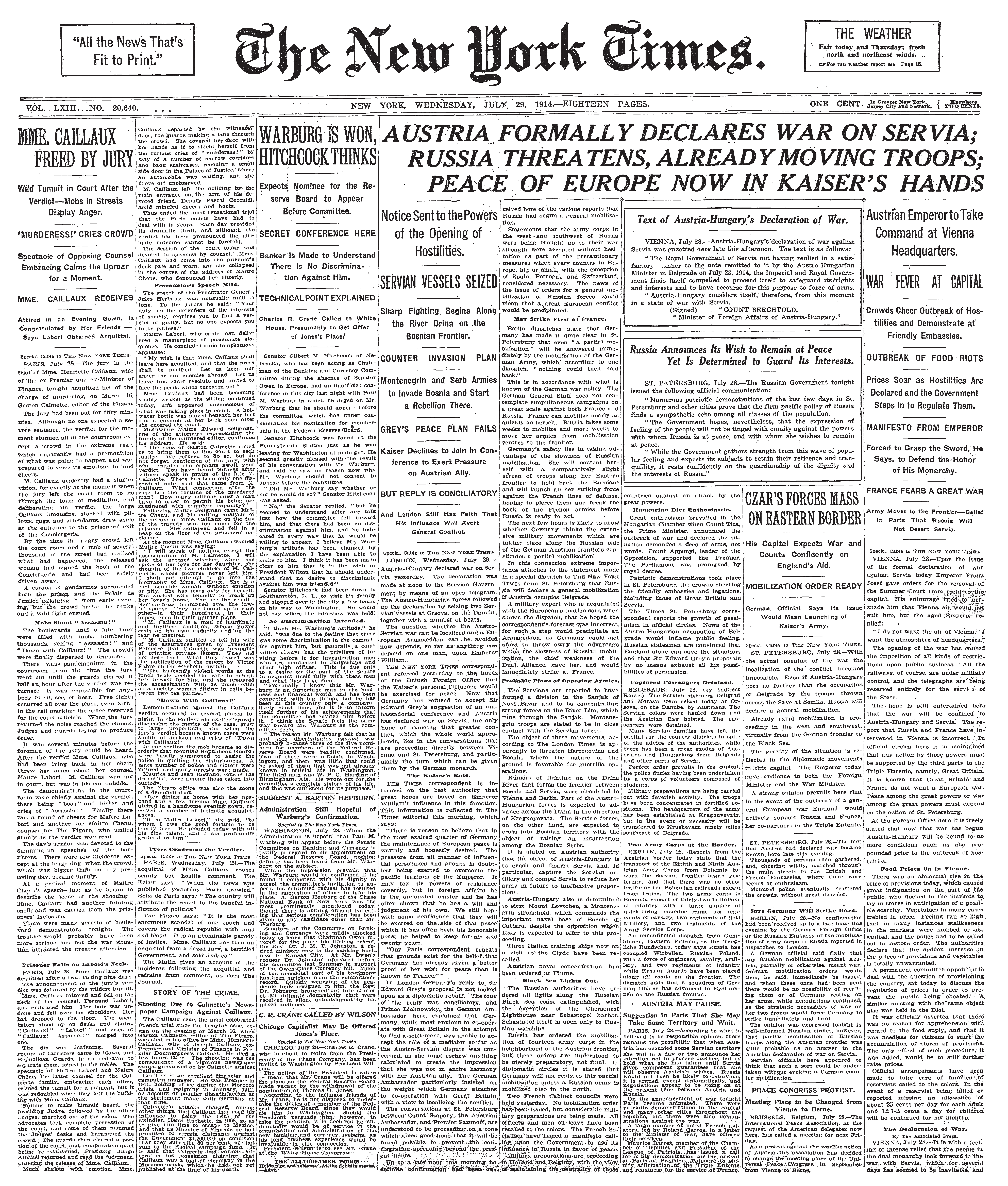
Imagine if websites were still using the font-faces and cramped layout of a century ago? This scan of a 1914 New York Times front page may look retro-cool, but it is not easy to read.
So where to go? First, listen to a layout specialist. Butterick’s Practical Typography is an excellent online-book that reads more like an informal guide than a declaration of What’s Good.
Typography in Ten Minutes?
The book is free and clearly yet simply designed within a website framework. No ads, he asks for donations for his work.
His chapter on Typography in Ten Minutes will open your eyes to much more than just what font, but how big margins should be (and why), how wide a line should be to make it the most readable by most people, even how “line-spacing” between the lines of text you create can help the eye follow the flow of the text, minimizing back-tracking. In five “rules” he simply states what many of us in education would agree: that information must be presented clearly and with purpose, and these rules can work effectively in Word as well as PowerPoint and certainly as well in online learning systems like NU’s Blackboard course management system.
There are other resources, too. Certainly a typographer like Matthew Butterick wants you to buy his fonts, but in addition to his opinion, he gives you guidelines to follow. He describes how to create a new “default” document template in Word, with the better line spacing and font choices already made for you when you open a new, blank document.
Whither even more font-astic?
Northwestern has recently made available Adobe’s Creative Cloud software for all its faculty and staff. It’s a large suite of apps such as Adobe Photoshop, and Illustrator, and the website creator Dreamweaver.
One of the included features is Adobe Typekit, a site that Adobe created with several well-respected typography firms, still called “foundries” as a reference to when type was cast out of metals.
The TypeKit website from Adobe helps you choose fonts recommended for paragraphs vs. headlines and choose whether you want them on your computer, or stored on the web is “kit” you can use on a given webpage.
Once the Creative Cloud software is installed, you can download fonts for use on your desktop, or store “web” versions of the fonts in a kit that is available for you to use on the web, on Blackboard, even on the Canvas platform, currently being evaluated by NUIT.
(If you are interested in learning more about working with Canvas at NU, contact the Learning Management Systems Initiative.)
Google Fonts is another web/desktop service that is open and no fees are required.. Google’s aim is more to make websites look good and load faster than with the mid-90’s font technology we have mired in for over 20 years. Fonts can be stored on the web for use on web pages you create, and also locally on your desktop so that handouts can have the same font as the website the students are using.
Imagine your work being seen as intelligent, clearly written, and a pleasure to read (and we all know how that feels!). Now imagine your work looking the same on a phone, a tablet, a desktop computer, and in a printed handout. And with Universal Design, you open up your work to those with diverse abilities.
Universal Design
Earlier we discussed the move to mobile-technology from the desktop. Lets add to this discussion of fonts the emerging field of Universal Design for Learning. People learn in different ways. Some are visual, some prefer text. Some can’t see well, others can’t hear well.
Universal Design helps create learning environments that “minimize barriers” to learning for all groups of students. This short explanatory video at the UDL site explains things very clearly. The site is full of consideration for others. Artistic, complicated fonts are difficult for some to read. Others who may suffer from sight degeneration like macular dystrophy have trouble reading things that do not have enough contrast between the light and the dark. Yellow text on a light background, that kind of thing.
As our educational world goes more and more online (MOOC, anyone?) thinking about who will come in contact with your teaching, and what skills for understanding they bring with them.
Alison May, Assistant Dean of Students in Weinberg College and the Director of Services for Students with Disabilities referred me to paper published by the National Academy of Sciences on the positive effect that increasing letter-spacing had on the abilities of a large sample of French and Italian students with dyslexia. While she cautions that dyslexia is much more complex an issue than simply changing font-spacing, the study does say that adding more space between letters increased the comprehension of the students in the study.
So, in thinking of how you want the world to perceive your teaching (fonts, layout, design) remember that the choices you make can substantially affect how well your ideas are perceived, as well as how clearly your ideas are received.
Zero capital O’s
The title slide of the Stanley Kubrick movie “2001” was created using a modern font called Gill Sans. He made a simple change, thinking it “looked better”. He had each zero replaced with a capital letter “O”. And thus was born a generation of people — when presented with a software serial numbers would forever ask, “Is that a zero? Or a capital O?”

This “remake” of the famous slide corrects the year, replacing Kubrick’s “O” letters with the font’s zeroes. Set in Gill Sans, without the wider “O” letters, the design looks less balanced, less eye-catching, but with more correct typography.
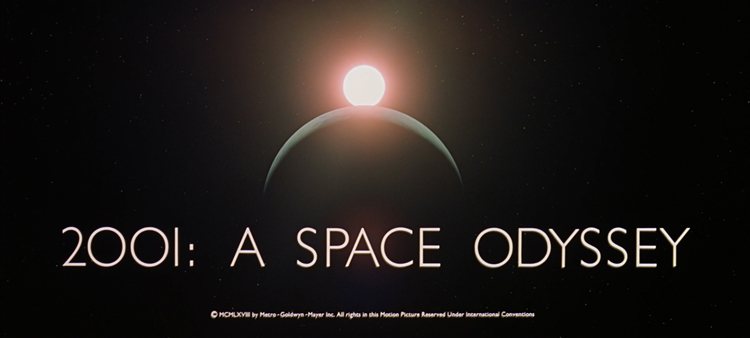
This is the title slide from Kubrick’s “2001: A Space Odessey”. Over the designer’s advice, Kubrick had each zero replaced with a capital “O”.
— Mark D Schaefer